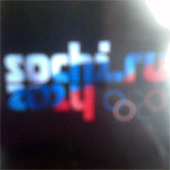
Sochi 2014 Olympic Logo leaked!
Olympics 2014 November 27th, 2009
I feel fairly certain, that the following is a real official Olympic logo for the Sochi 2014 Winter Olympic Games that will be presented this upcoming Monday.

That’s right, it’s what you see – “sochi.ru 2014” painted with color of the Russian flag, plus the Olympic rings. Stop for a moment before reading further and look at it: how do you feel about it? Do you like it?
Why I think this is it? I might still be wrong about this, but a few things here and there come together:
- Comments from officials how this will be unlike anything before
- The “explanation” comments that came with the leak (read on), and how they sounded in line with everything that government is doing while spending a lot of money of various project in Russia, not just the Olympics
- The fact that Russian Olympic committee took over sochi.ru domain name
- Unofficial confirmation from a person I believe is closely involved with organizers of Sochi 2014 Games
For some time now officials hinted that we’ll see something new, exciting and modern. And on November 25th, five days before the logo officially announced, Russian «Vedomosty» newspaper leaked this blurry photo of the logo. According to the article the point of this design is to promote Sochi, Russia and to tie Sochi to Russia in people’s mind. Love it or hate it you’ll probably agree that this design will probably help to reach this goal. In addition, from personal experience, many people in Eastern European – Poles, Slovaks, and Czechs I’ve talked to – who know about Sochi, think it is part of Georgia, which has never been the case. This idea of using even logo to “advertise” Russia goes along the line with the government’s position of getting the most out of money they’ve spend, and with spending a lot of money in recent years to improve the view of Russia in the world (like English language news channel, the use of top branding agencies, etc. – things that many other developed countries do, to be fair).
Another thing that will be unique about the logo is that the official sponsors will be allowed to use their corporate colors on the logotype.
Vedomosti sources claim the logo design is by Interbrand (here’s their Imagining the new Russia article), and no certain info on compensation for logo design. Though they quote design experts putting the price tag in the $600 000 – $1 000 000 million range.
So, what do you say – good? bad? How do you like it?
And what do you think they should do to Sochi.ru domain name after the Olympics?
Previous articles on this topic:


November 30th, 2009 at 1:29
No! This shown logo is not an ideal logo. It must be rejected bid logo.
November 30th, 2009 at 19:23
Wow! Amazing. An Olympic logo for a digital world!
November 30th, 2009 at 19:43
yeah, i think that was part of the idea! :)
anyways, see home page for an official, slightly updated version.